
We have written plenty about data visualization previously, and if you haven’t gone through all the key points already, then we suggest you take out a few minutes to read: Getting Started to Data Visualization.
Once you have brushed up the basics, or you are an expert programmer who wants to dive straight into the thick of things, then proceed and read onwards to find out more about data visualization softwares.
What are the Best Tools for Data Visualization?
The importance of data visualization cannot be stressed enough. With corporate competitions increasing day by day and demands reaching new heights, the business world is steadily becoming more cutting edge. In order to keep pace with it, it is imperative to learn and master data visualization skills.
And what better way to do so than mastering data visualization softwares? There are indeed a vast number of tools that manipulate and interpret data in a variety of ways. From free products to costly softwares, the wide range of such tools sees no end.
After comprehensive studies and in-depth comparisons, our research has revealed which of the softwares are truly worth their mettle. For your aid, we have compiled a list of the top 6 data visualization softwares in 2020 and explained why they are good enough to make it to our exclusive list.
Our Top 6 Data Visualization Softwares
Below is the list of our top 6 DataViz tools, ranked in order of precedence:
1- Tableau
Tableau is the most highly reviewed and rated data visualization software of all time. Over 57,000 satisfied customers use Tableau to make their complex data speak loud and clear.
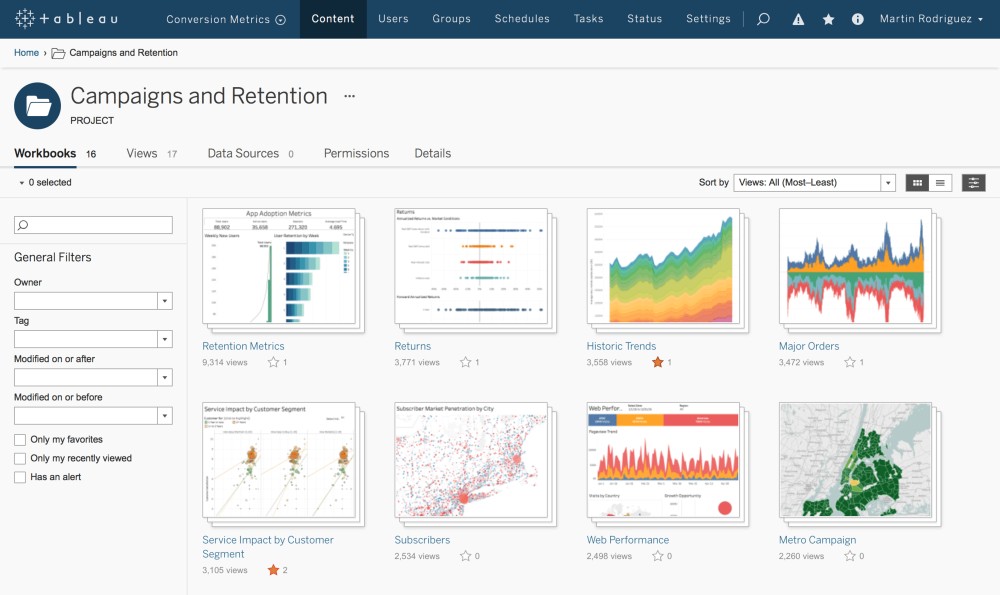
Pros:
- Most widely used data visualization tool worldwide.
- Can create interactive visualizations and graphics.
- User-friendly with an excellent customer support system.
- Compatible with Big Data, ad-hoc analysis, and AI.
- Integrated with Hadoop, My SQL, Amazon AWS, Teradata, and SAP.
Cons:
- Free trial period of only 14 days after which you have to pay to use it.
Tableau has its own introductory courses and 2- Power BI
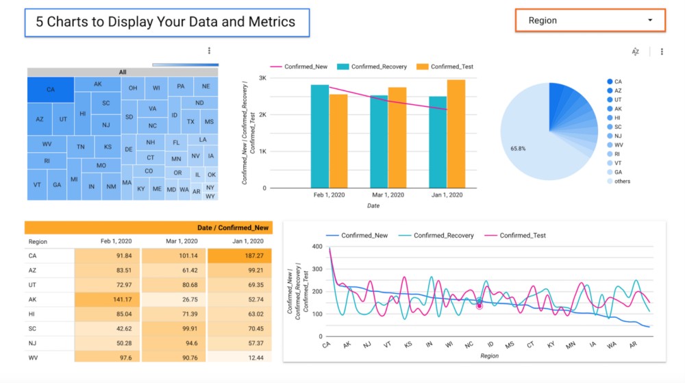
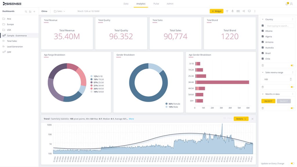
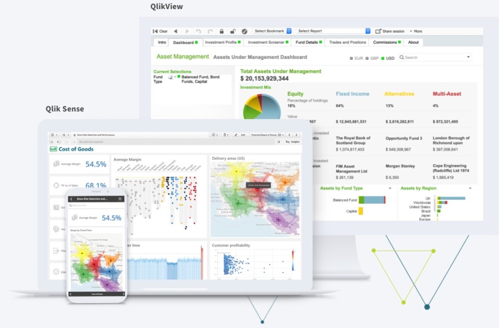
Power BI is a popular data visualization software introduced by Microsoft to much critical acclaim. Targeted for small to medium-scale businesses, Power BI is a versatile tool with many user-friendly features. Pros: Cons: If you have some basic charting knowledge already, that we suggest you this online course on Udemy, Microsoft Power BI – A Complete Introduction [2020 EDITION] With all the variety of software available in the market today for different price ranges, it is impressive how Google offers one without charging anybody a dime. That’s right, Google Charts is free for all data visualization software which comes packed with many high-level features. Pros: Cons: Udemy is a popular online interface that teaches programming to both beginners as well as advanced users. You can visit here to take an extensive course on Google Charts by Udemy and here you can find a complete guide for the Data Studio. Complete Introduction to Google Data Studio Featured in the Top 20 Data Visualization Softwares of 2020 based on customer reviews, Sisense was first found in 2004 and has carved a name for itself in the digital market since then. Pros: Cons: If you are an advanced-level programmer, then we suggest you visit here to take some webinars for high-level training prepared by Sisense. Tableau’s biggest rival with a loyal following of over 40,000 users, Qlik is a prime player in the field of visualization, thanks to the Qlikview tool. Pros: Cons: On Udemy, you can choose from a multitude of online courses available to learn and master Qlikview. Here is our pick The Complete QlikView Boot Camp Established in 2012 in the US, Looker is a handy product that enables companies to present their data in an attractive manner. Pros: Cons: Here, Looker has a guide which can quickly take you through the fundamentals of it. Based on JavaScript, FusionCharts is an Indian software company that has built a name for itself in the data visualization market thanks to its flexibility and scope. Pros: Cons: To get started on FusionCharts and learn how to expertly create complex data visualizations, here is their own documentation. We hope this list of data visualization softwares will aid you in deciding which one suits your needs the best. In addition, thanks to the courses we have picked out for you, we believe that you will learn how to use these softwares to their max potential and be able to start using your chosen product in no time. So go ahead and select a visualization tool, complete the teaching courses, and start converting chunks of boring data into beautifully interpreted and displayed graphs and charts for your business.
.
3- Google Charts and Google Data Studio
4- Sisense
5- Qlikview
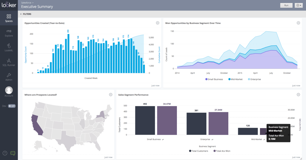
6- Looker
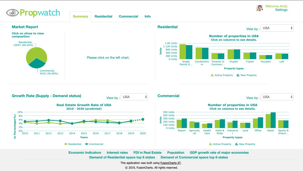
7- FusionCharts
Conclusion